Magic Color Composition: 7 Easy Tips To Improve Your Photos
Orange and blue light illuminates a modern building facade in Vienna, Austria.
My journey in photography has taught me much about the power of composition and how color can positively impact the emotional power of the images we create. Here’s what years of study and practical experience has taught me about how to improve your photos through the magic of color composition.
Color composition in photography can evoke emotion and influence how people respond to images. Photographers use Hue, Saturation and Luminance to alter color rendition and affect how colors relate to each other. Similarly, white balance shifts the mood of an image on a warm/cool color axis.
Color is a critical element underpinning great composition. Let’s explore some of the ways intelligent and thoughtful use of color can significantly improve the composition in your photos.
Table of Contents:
What Is A Color Composition
A great composition is produced by bringing together a range of otherwise disparate, unconnected or competing elements into a visually pleasing arrangement.
Great composition emphasizes the primary subject or subjects within the frame and explores their relationship to each other and, where appropriate, the environment in which they’re depicted.
1. Use Color To Make Photos With Impact
Try to compose your photos around color. Take a look at the image of the building at the top of this post. It’s a building in Vienna, Austria which I photographed at dusk.
The opportunity to explore composition in this scene was obvious and it was great fun making the image which is, incidentally, based entirely around composition.
Shapes and lines are important in this picture, but it’s the color of the light, both natural and artificial, that’s at the heart of the emotive power of this image.
Notice how the warmth of the orange incandescent (i.e., tungsten) interior lighting, shinning through the windows at the bottom of the frame, contrasts with the cool blue light of dusk reflected in the windows above and on the building’s facade.
That color contrast was what drew me to the scene and, ultimately, the reason why I believe the image works.
Surf and mist at sunset, Aireys Inlet, Great Ocean Road, Australia.
2. Stir Emotion through Color Composition
Take a look at this powerful and emotive image of surf crashing on the beach at Aireys Inlet. The lighting was difficult in the extreme, but I was able to make full use of the warm sunset light and manage the scene’s high dynamic range to produce the result you see above.
When a scene is as high in contrast as this one it’s impossible to render detail in the full range of tones from the deepest shadows to the brightest highlights.
However, by exposing for the highlights I was able to hold most of the detail in the bright areas of the image and use the darker areas of rock and foliage to frame the scene in a way that draws attention to the water.
The framing and the evocative use of monochromatic (i.e., one color) color were essential elements in creating such a successful color composition.
To dramatically improve your own compositions I urge you to embrace color in your photo making. Whether it’s monochromatic, pastel, highly saturated or contrasting colors you’ll find color is, more often than not, the most important element of composition in a photo.
Just think about how you might be able to successfully employ color to improve your own photos. As a starting point, consider the following:
Color stirs emotions such as lust, anger and fear.
Color elicits a sense of calmness, melancholy or happiness.
Color evokes notions of purity, good and evil.
3. Use Color to Describe Who We Are and What We Do
Of course, the use of color in our world allows us to categorize people and determine where they fit in various social, political and religious contexts.
Colors such as black or navy blue are used to signify the professionalism of a business executive.
Likewise, the colors red, saffron, white and black help us identify various religious orders and someone’s status within that order.
Color is also widely employed to identify allegiance to a team or nation, such as at a sporting event. The success of this approach is so successful that it’s not just the players, but also their supporters, who wear the colors associated with their team or nation.
Branding in the commercial world is another example of how color has been used over time. In the world of photography think yellow for Kodak and green for Fuji.
4. the Language of Color and How it Impacts Our Photography
There are three ways by which we can describe color in a photograph.
Hue is used to quite clearly designate the actual color of the color. In other words it’s not just red, it’s Ruby Red or Tuscan Red.
Saturation describes the vividness or purity of a color. It’s usually possible to designate a color as displaying either low, medium or high levels of saturation.
For example a rich or vivid color would be described as being high in color saturation.
Conversely, a color with relatively low levels of saturation would be described as a pastel. A pastel tint is created by diluting the color in question with a significant amount of white.
If you’d like to know more about color saturation check out my post on Color Saturation in Photography.
Luminance, also known as Value, refers to the brightness of a particular color. Therefore a dark blue would display low levels of color luminance, while a bright yellow has high levels of color luminance.
5. Master Color Temperature for Accurate or More Emotive Color
Color temperature, which describes the actual color of the light, is a critical element in color composition.
While we use the Fahrenheit or Celsius scales to measure heat, the actual color emitted by a light source is defined, on a warm to cool scale, as color temperature and described in Kelvin degrees or degrees Kelvin.
I’ve written quite extensively about color temperature, which is controlled via a series of white balance presets in your camera. I find the subject fascinating and there be a really fascinating subject.
Whether you’re a landscape, architectural or portrait photographer a good understanding of white balance and how to manage color temperature is an essential element on the way to mastering your craft. Doing so will enable you to achieve more accurate color and create more emotively compelling images.
I wrote a special post which you’ll find really useful. It’s titled White Balance and Photographing Icebergs.


6. How To Effectively Compose With Color In Your Photos
When we look at a well designed color photo, one or more of the following will occur.
Dark objects will seem to advance
Light objects will seem to recede
Warm colors (e.g., yellow shirt) will appear to advance
Cool colors (e.g., blue sky) will seem to recede
Other facts that are worth remembering include the following:
Warm colors (e.g., red) excite the mind
Cool colors (e.g., green) calm the mind
Understanding and, wherever possible, implementing the above learnings in your own photography will help you make better photos through more effective composition.
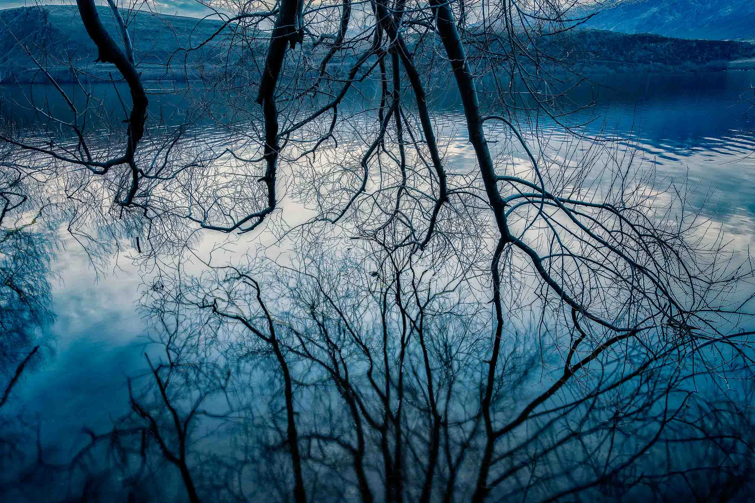
Composition based around autumn color on a frosty morning, Arrowtown, New Zealand.
7. Use Color To Better Tell A Story With Your Photos
Photography is all amount communication. Color can be used to guide the viewer where you want them look and also influence how they feel about what they see.
You can employ color to express a particular point of view or to explore a particular mood or feeling.
I made this photo near Arrowtown, on the South Island of New Zealand, early one winter’s morning.
I remember working to compose the image in such a way so that the warm color of the tree was offset beautifully against the cooler colors of the frost covered ground.
I feel this image successfully blends reality with the more surreal elements these color relationships bring to the scene in a way that romanticizes the moment.
I felt elated after making this image. It was a great reward near the end of what had been a very busy and sometimes difficult trip.
The experience of being able to record such a moment, as though between heartbeats, and bring all the otherwise disparate elements together in a cohesive manner is key to great composition.
Conclusion: Improved Color Composition Makes You a Better Photographer
We live in a world of color and, given that most of the photos you make are likely to be in color, it’s important to think more about how you use color in the photos you create.
Color, a key element in composition, is so much of what photography, as an art form, is all about. Color allows us to explore narrative, theme and story in a range of ways from subtle to visually dynamic.
You can recognize color in the world about you in a number of ways, including the following:
The changing of the seasons
The color of light throughout the day
The color of objects, within the frame, and how they relate to each other
It’s important to pay attention to color and be able to manage it through correct application of the white balance presets on your camera.
As a result you’ll be better able to recognize the emotive qualities of color and employ them, through creative composition, in your own photography.